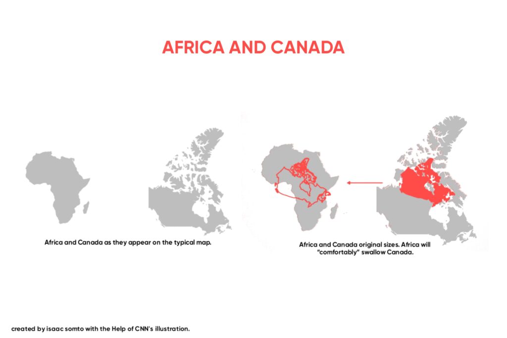
The typical map found on Google Maps, the back of your paperback diary, OpenStreetMap, Bing and literally everywhere “not deep” portrays Canada, a country with an area of 9.985 million km² as closely or the same size with (if not bigger than) a continent with an area of 30.37 million km². This continent is Africa. In reality, Africa can fit in three or more Canadas . This means one thing, the typical map doesn’t portray the true size of Africa.
But why doesn’t it? Let’s look at this together.
The Issue with the Map
The traditional map seen literally everywhere is largely misleading and this is because it makes use of the Mercator projection which was made for sailors to know the position of a particular geographical location.
The Mercator projection, created by European cartographer Geert de Kremer in the 16th century, makes countries near the poles look bigger and those at the equator look smaller. It follows that, the Mercator projection fails in depicting the real sizes of continents, countries, places etc.
CNN stated about this projection in a report that: “The 1569 Mercator projection was made for navigating the seas — drawing the meridians and parallels as straight lines that cross at right angles helped sailors to navigate some of their first treacherous voyages around the world.”
A look at the map made using the Mercator projection, will reveal how how small Africa looks. In reality, the true size of Africa is about twice the size of Russia; and it is bigger than Canada, the United States and all of China put together.
On the typical map, Greenland which is the world’s largest island and is located between the Arctic and Atlantic oceans, east of the Canadian Arctic Archipelago appears bigger than, if not the same size as Africa, in actuality Africa is about ten times the size of Greenland. This Island is not even bigger than the Democratic Republic of Congo (DRC), a country in Africa. “Greenland, which looks about the same size as the whole of Africa on the Mercator, is a classic example. In truth, it is no bigger than the Democratic Republic of Congo.” says CNN.
Even Canada looks extremely large on the Mercator projection that popular vlogger, Nas Daily, said that as a kid he “feared” Canada because of its size on the map.
This wrongly sized map poses lots of problems, especially since it is widely used by prominent sources. The map not depicting the true size of Africa reduces Africa’s geographical, social and maybe political significance. It makes casual map viewers underestimate Africa. For those in Western countries that appear bigger, it gives them an incorrect measuring stick of Africa’s size.
Was the size of Africa reduced by accident or intentionally?
Many people, including scholars believe the incorrect map size is/was an intentional move. President of the International Cartographic Association and professor of cartography at the University of Twente, Netherlands, Menno-Jan Kraak, is one of the many scholars who believes that it was no accident that the true size of Africa wasn’t portrayed in the traditional map. In his words, “That European and North American countries are enlarged is no accident. This system provided more space for Western cartographers to mark towns, cities, roads etc in their part of the world. There was, of course, much to map in Africa, too, but that mattered less to the cartographers up north.”
One thing to note from the perspective of scholars who do not agree to the notion that the wrong sizes of countries on the traditional map was an accident is that a some of these scholars believe the reduction of Africa was done intentionally because of the whites viewed or wanted to view themselves as a superior race.

Professor of Global Media and Politics at Goldsmiths, University of London, Marianne Franklin says, “The world maps that prevail today have been embedded in Western imaginations since the British empire. They continue (to prevail) despite many challenges to their fairness and accuracy because they underpin the ongoing Anglo-Euro-American presumption that the world belongs to them, and pivots around these geo-cultural axes.”
Most people who believe that Africa having a wrong size on the map was an accident states that the Mercator projection took the globe(a three dimensional thing) and tried to replicate it on a paper(a two dimensional thing) using the equator as the center of the map which brought about the distortion and huge gaps on the map, especially near the poles.
What then is the true size of Africa?
Africa is really big, not only in population but also in land mass. The widely used map doesn’t do justice to Africa’s true size because it uses the Mercator projection, a fact that has been established earlier on in this piece. They exist other map projections that seek to correct this issue, thanks to the researchers who are dedicated to portraying the true size of continents and countries in a map. Various projections and campaigns exist that are correcting the wrong of the typical map. Though there’s nothing like a perfect map, these other maps try to at least create something close to the true size or something that gives a feel of the real sizes of continents and countries.
In Boston, schools use the Gall Peters Projections to teach school children about maps, this is one of the campaigns at correcting the wrongs of the actual map.
The Gall–Peters projection is one of the projections that rightly displays the real sizes of continents and countries, it “is a rectangular map projection that maps all areas such that they have the correct sizes relative to each other.”
The shapes of countries and continents appear distorted in the Gall Peters projection because it gives an equal area projection.
Despite these positive campaigns, it’ll be difficult to correct the errors of the map as the Mercator projection is already used widely from GPS systems to the map at the back of your diary to online maps.
Hopefully, people will see these maps as guides to a geographical area and not a representation of the geographical area’s size.
Do you know that some blacks are born naturally with blue eyes? Read our article on Blacks with blue eyes.